During the development of our company website, we came across an interesting UX dilemma. The website uses full-width horizontal blocks of content with varying background colors. This caused problems with the fixed-position side navigation, since black text becomes hard to read when displayed over a non-white background.

While there are various ways to deal with this, we didn’t want to change the design of the site. Instead we decided to create something that would change the text color of the side navigation depending on the background color and update when user scrolls the page or generally moves around doing user-y things.

CSS clip:rect() to the Rescue
At first we were tempted to abuse CSS gradient text backgrounds and simply change the gradient stops based on the scroll offset, but that proved to have too many limitations (primarily the lack of a single element to apply the gradient to) and wonky browser support (I’m looking at you, Android stock browser). And what if we wanted to change more than just the text color? Suddenly we imagined a lot of scenarios where such a feature might be useful, spawning another question: how do we make all this reusable for others to enjoy?
Searching further and contemplating our options, one of the most underused CSS attributes came to mind: <a href="http://tympanus.net/codrops/2013/01/16/understanding-the-css-clip-property/">clip: rect()</a>. Using this attribute we could “clone” the menu to create multiple layers with different CSS styles (like color) and clip those layers to produce the desired effect. So we did that.
And we call it: jq-clipthru.
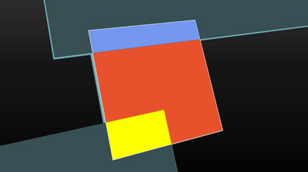
Below is a rough mock of how the stacking works. The orange element overlaps the two gray blocks, spawning two new clones of the orange element. Those are clipped to only appear over the overlapped area and their CSS styles are determined by class of the cloned layers (making them yellow and purple in this case). Note that the whole orange block is merely overlayed by the yellow and purple clones. It would be visible underneath them if they had no background-color.

Surprisingly, the limited rectangular-only CSS clip feature has a few nice properties that make it a strong candidate for exactly this task.
- It does not influence document flow and layout.
- The clipped area is fully hidden.
- The clipped area cannot be interacted with. This proved to be a critical point since the other approach we considered, SVG clipping/masking, works as a post-process and still allows the user to interact with the clipped part of the topmost layer blocking interaction with the layers underneath.
- Perfect browser support, including Internet Exploder.
- It’s fast. CSS fast.
The world would probably spin off its axis if CSS clip had no drawbacks. Fortunately, it does.
- At this time it’s purely rectangular with no way to clip a complex polygon. This presents a problem when background transparency is involved (more on that below).
- It only works with elements using
position: absoluteorposition: fixed. While this is generally quite impractical, it is not such a dealbreaker in this case. You will almost always be using this effect on an out-of-flow positioned element, or you can adjust your code to work around this limitation.
The Transparency Problem
And thus would end the story of jq-clipthru, if not for background transparency. Consider the following: in some scenarios (like our website) you will want to keep the background of the clipped elements transparent. This means that any user action that can change the design of the topmost cloned layer (like hovering over a link that has some :hover effects applied) might reveal the original layer below itself (containing a link that has no :hover style applied), because the user action isn’t shared across all clones. There are two different approaches to solving this problem:
- Somehow pipe user interaction to all layers. This is complicated, leaves space for volatile and likely unsolvable edge cases and doesn’t address the real problem (that stuff is still visible underneath the cloned area).
- Mask out the area of the original layer that overlaps with its clones. In the example above, this means that the parts of the orange area would be clipped underneath the yellow and purple blocks. That’s where a rectangular-only clip is no longer sufficient, and we had to bring out the big guns (and their quirky behavior) by using true SVG masking on the original element. The effort required to make true SVG masking work cross-browser is enough for an article of its own (rest assured, it’s coming soon).
Since calculating where the elements overlap is straightforward from this point, most of our work revolved around making it fast, flexible and polishing edge cases. As it turns out, jq-clipthru can be used for far more complex designs than merely changing the font color, and we’re quite curious about what others might use it for (hey, you can mount it on draggable!).
There are various configuration options to make the widget more robust in the face of more complicated use cases (find them in the Github documentation). At the same time, jq-clipthru is certainly not in its final state and has places to go and markup to see. Contributions, bug reports, words of praise or criticism are all highly welcome! You can see what it did for us live on our website, or you can check out the repo on Github.
